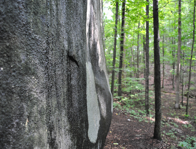
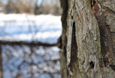
When i first went about this photo i tried taking a photo of the bark head on and up close but when i saw the result i wasn't satisfied with the way it looked. So i tried some other approaches, birds eye view/ worms eye view but i still didn't like the way the bark was coming out on camera. It was too dull and washed out. I finally chose to take a photo at a side angle, this time including scenery in the background. I was finally very happy with the way it turned out. I love how much depth the scenery in the background created. I wanted the focus of the photo to be the rough texture of the bark on the right side of the photo. I think i succeeded with this because of, again the depth, and the use of leading lines (the fence pole). I thought that since in my original attempt the bark looked very dull, i would try using the contrast of the bright snow against it. Over all i really ended up enjoying my final design of the photo and i personally think it is very appealing to the eye.
When given the texture assignment, i knew automatically that i wanted to use the texture of wood as one of my photos. I then decided that tree bark would be my best option for this, as it does have a very strong and vivid texture to it. As i said before, i first tried taking a photo of the bark head on and close up but i thought creativity wise it looked to boring and dull. I then decided that i wanted to add some of the winter scenery in the background to give more of a crisp, calm feel toward the photo. I also thought that having a completely blurred background would really draw the eye into the textured bark up close.
For this photo i obviously wanted the focus to be on the bark and its texture. So i decided to go with an aperture of about f/2 so that the bark up close to the camera is the only thing in focus. I chose to have snow as my background so i didn't want it to be to bright washed out, considering it was also a sunny day. So i ended up going with a lower ISO of about 200 - 400.
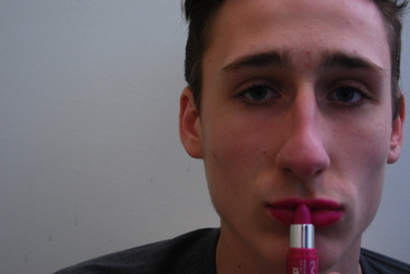
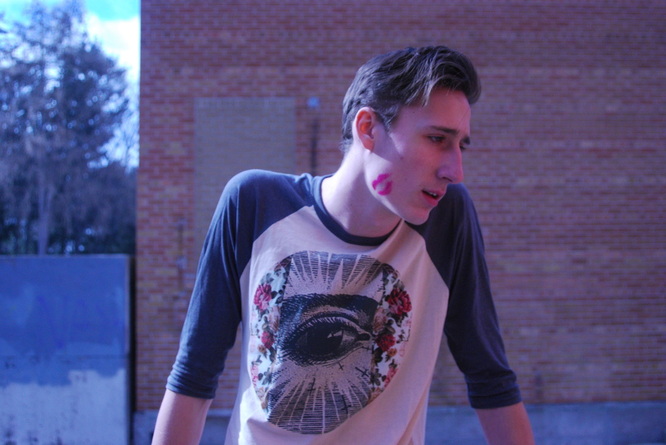
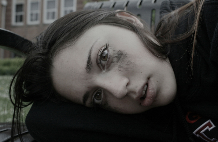
I knew when i started this assignment that i wanted to show my simple object, lipstick, in a more uncommon way. So i chose to have a male put it on. In our society it is very much frowned upon to have men wearing lipstick, and thought to be as weird and "wrong". I wanted to express that uneasy feeling in this photo. I also knew that right away i didn't want this photo to be something that was flamboyant, i wanted it to be more raw.
For the design of this photo i wanted a plain white background so that the focus would be purely on Rory, also to make the colour of the lipstick stand out more. I also chose to have dark lighting to express the dark feeling of the photo. I wanted Rory's facial expression to show emptiness with slight sorrow, to almost make him look ashamed of himself. To express this and the depth of his face i also decided last minute to make half his face more shadowed than the other.
I chose to have Rory off to the side instead of straight in the middle because i felt with this type of odd photo it would make it more appealing to the viewer. I also had Rory hold the lipstick straight toward his lips because i felt that it really drew the viewers eye more into the colour of the photo. Since i wanted this photo to have a more raw feeling i didn't ant to have any crazy, bright light so i went with a lower ISO of about 200 - 400.
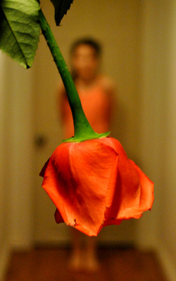
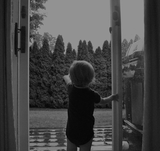
Our assignment was to create an optical illusion so i thought that it would be fun to take a flower and make it look like the bottom of a girls dress. I wanted to make sure that the flower and the girls top matched in colour to make it look more like it was a full dress. I also wanted it to be simple photo so i went with a simple background to make the focus strongly on the flower dress. I also thought that since i wanted the photo to seem more simple and dainty i would just have the girl standing in the middle to give it more of a balanced feel. At first i wasn't sure how i wanted my lighting to be in this photo but then i decided to go with a more dimmed lighting because i felt it complimented the colour of the dress and made the photo feel more warm and appealing to the eye.
Instead of photographing the girl right in front of a plane wall i went with the idea of photographing her in front of the door because it gives her a more natural framing, again bringing the focus onto her and her flower dress. Also because i was working in dim light but still wanted to have a dimly lit photo i went with an ISO of about 800 - 1600. At first i thought i wanted both the girl and the flower to be in focus but then i decided to go with just having the flower in focus because i felt it was more appealing to the eye and really tied together the whole "flower being the bottom of the dress" thing.
Instead of photographing the girl right in front of a plane wall i went with the idea of photographing her in front of the door because it gives her a more natural framing, again bringing the focus onto her and her flower dress. Also because i was working in dim light but still wanted to have a dimly lit photo i went with an ISO of about 800 - 1600. At first i thought i wanted both the girl and the flower to be in focus but then i decided to go with just having the flower in focus because i felt it was more appealing to the eye and really tied together the whole "flower being the bottom of the dress" thing.